Skedulo Plus extension components overview
Overview
The Skedulo Plus UI components are defined at the root level of the Skedulo Plus extension definition, the ui_def.json file.
The components are used to define the layout of the page and the first page that is displayed when the extension is opened.
| Property | Description |
|---|---|
firstPage |
Indicates which page to display first in the extension. A page is a layout component that is defined in the ui_def.json file. |
pages |
An object that contains a type that specifies the layout for the page. An extension can consist of multiple pages. |
readonly |
Indicates that the forms is read-only. When set to true, there is no Save button. |
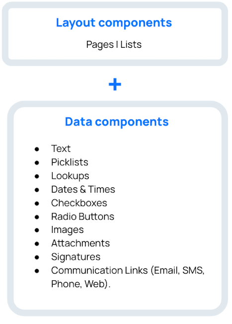
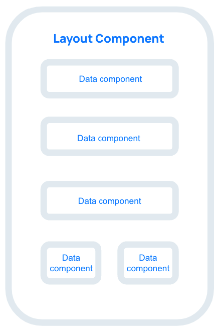
Page types and page components
Skedulo Plus extensions are made up of either a single page, or of bundles of pages.
Pages define the structure of the page and layout of the page components. Data components are the smallest units that represent a piece of data in the UI definition, such as how a text field or a button is rendered.
A page in a mobile extension can have only one page component (either a list page component or a flat page component), but it can have multiple page components.
 |
 |
Form definition example
The following example demonstrates how these form properties are defined in the ui_def.json file for a Job Products list page.
{
  "firstPage": "JobProductListPage",
  "pages": {
    "JobProductListPage": {
      "title": "form.JobProductListPages.JobProductTitle",
      "type": "list",
      "sourceExpression": "formData.JobProducts",
      "emptyText": "form.JobProductListPages.Empty",
      "itemLayout": {
        "type": "titleAndCaption",
        "title": "form.JobProductListPages.ItemTitle",
        "caption": "form.JobProductListPages.ItemCaption"
        }
    }
  },
}
Feedback
Was this page helpful?